
Why Does One Apple Steal the Show?
Have you ever noticed how one bright red apple in a basket of green ones instantly catches your eye? That’s no accident—it’s the Von Restorff Effect at work, a psychological principle that makes the unique unforgettable. In a world overflowing with visual noise, how do you make your brand the red apple that everyone remembers?
The Power of Being Unforgettable
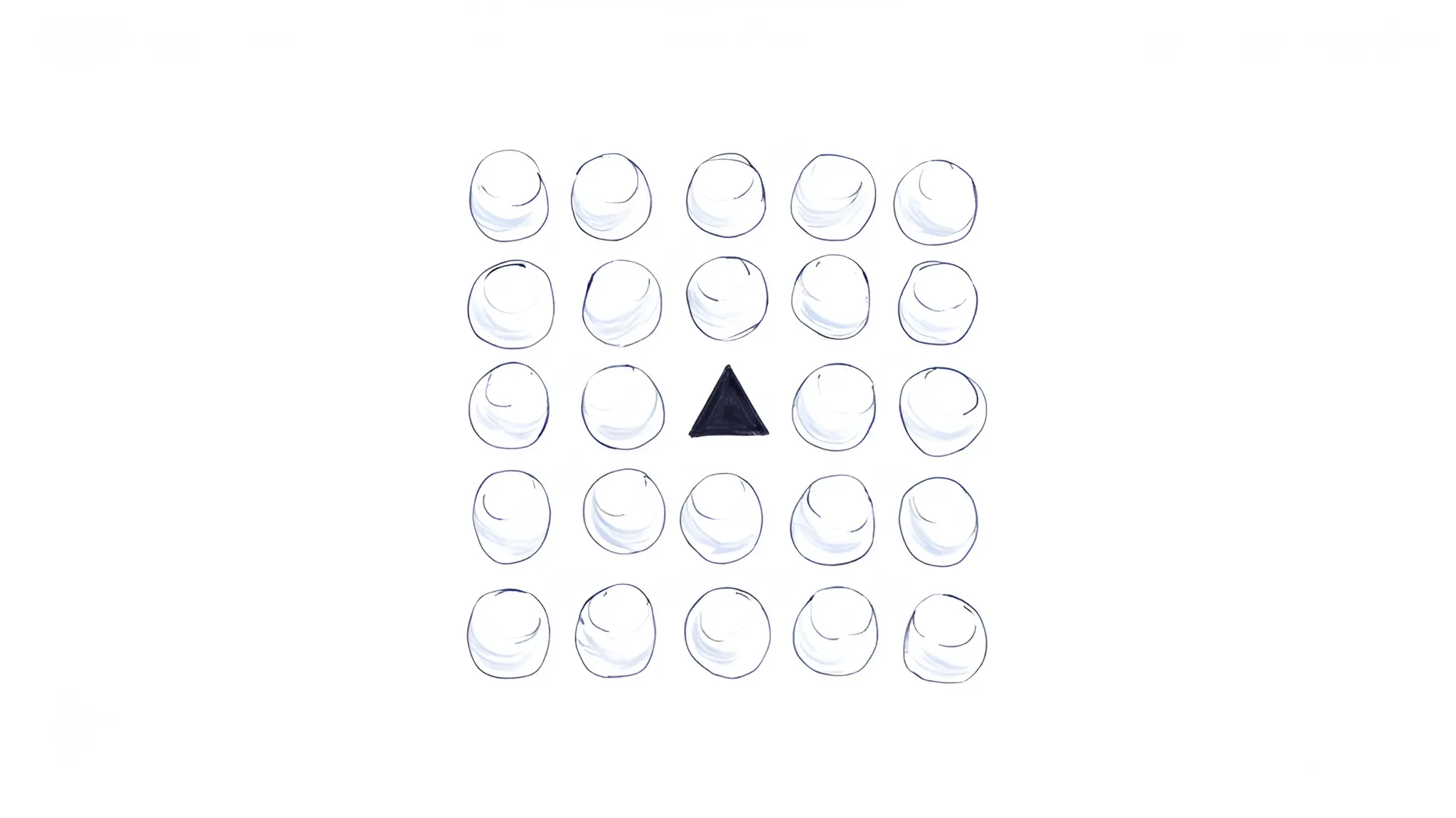
The Von Restorff Effect, also known as the Isolation Effect, teaches us that distinctive elements stand out and stick in our minds. By strategically making one aspect of your design pop, you can guide your audience’s attention and create a lasting impression.
The Science Behind Standing Out
Discovered by German psychologist Hedwig von Restorff in 1933, this principle emerged from experiments showing that people are more likely to recall items that differ from their surroundings. In design, it’s a powerful tool to break through the clutter of sameness. Whether it’s a bold color, an unexpected shape, or a unique font, the isolated element becomes the focal point, etched into memory. Brands like Apple and Coca-Cola have mastered this, using it to differentiate themselves in crowded markets.
Crafting the Spotlight: A Deep Dive
Core Characteristics and Values
The Von Restorff Effect hinges on contrast and singularity. It’s about creating a deliberate standout—something that feels intentional, not chaotic. This principle values clarity, memorability, and emotional resonance. It’s not just about being different; it’s about being meaningfully different in a way that aligns with your brand’s story and values.
How Successful Brands Apply This Principle
Consider Apple’s iconic product launches. Amid sleek, minimalist designs, they often highlight one feature—like the vibrant Retina display or a single, bold tagline—that captures attention. Similarly, Spotify’s annual Wrapped campaign uses vivid, personalized data visualizations that stand out against their typically dark interface, making the experience unforgettable. These brands use the Isolation Effect to create a focal point that feels both surprising and authentic.
Key Design Elements That Communicate the Archetype
To leverage the Von Restorff Effect, designers can manipulate:
- Color: A single vibrant hue against a neutral palette (think Coca-Cola’s red logo on a silver can).
- Size: Oversized typography or a larger-than-life graphic.
- Shape: An unexpected geometric form amidst uniformity.
- Placement: Positioning one element off-center or in an unconventional spot.
- Texture or Style: A glossy button on a matte background or a handwritten font in a sea of sans-serif text.
The key is restraint—only one element should stand out to avoid overwhelming the viewer.
The Psychology of Capturing Minds
The Isolation Effect taps into our brain’s natural tendency to prioritize novelty. Our attention is drawn to what’s different because it signals importance or relevance. For audiences, this creates an emotional hook—whether it’s curiosity, excitement, or trust. When a brand uses this principle effectively, it feels like a conversation starter, inviting the viewer to engage more deeply. For example, a single bold call-to-action button on a website can make users feel empowered to click, as it stands out as the clear next step.
Mastering the Art of Isolation
✔️ Be Intentional: Choose an element that reinforces your brand’s message. A random pop of color without purpose dilutes impact.
✔️ Use Sparingly: Highlight only one or two elements to maintain focus. Overuse leads to visual clutter.
✔️ Align with Context: Ensure the isolated element feels cohesive with the overall design. A neon green button might stand out, but if it clashes with your brand’s aesthetic, it risks alienating your audience.
✔️ Test for Impact: A/B test designs to confirm the standout element drives the desired action, like clicks or conversions.
✔️ Balance Simplicity and Boldness: Pair the isolated element with a clean, uncluttered background to maximize its effect.
Avoiding the Traps of Overdesign
⚠️ Overdoing It: Too many “standout” elements create confusion, not clarity. Stick to one focal point.
⚠️ Ignoring Brand Identity: A bold choice that feels out of place can erode trust. Ensure the isolated element aligns with your brand’s voice.
⚠️ Neglecting Accessibility: A standout color or font must still be legible and inclusive. For example, avoid low-contrast combinations that exclude colorblind users.
⚠️ Lack of Purpose: Don’t make something stand out just for the sake of it. Every choice should serve the design’s goal, whether it’s driving sales or building recognition.
Make Your Brand the Star
Ready to make your brand the red apple in a sea of green? Experiment with the Von Restorff Effect in your next design project. Start small—try a bold button or a unique headline—and watch how it transforms engagement. Share your thoughts or examples in the comments; I’d love to see how you’re using this principle to stand out!
Love these design insights? Dive into my series on Jung archetypes like the Hero and the Sage at https://blog.odavila.com. Ready to make your brand unforgettable? Let’s connect at https://odavila.com/contact for a quick discovery call.