
Can a Single Image Speak Louder Than Words?
Imagine you’re navigating a bustling airport in a country where you don’t speak the language. Amid the chaos, a simple arrow pointing right or a stick-figure restroom sign catches your eye. Instantly, you know where to go. No words, no confusion—just clarity. That’s the power of iconography and pictograms. These tiny visual cues transcend language barriers, guiding us through complex environments with elegance and precision. But how do they work, and why do they feel so intuitive? Let’s explore the fascinating relationship between iconography, pictograms, and the language we all speak—visual communication.
Unlocking Universal Communication
Iconography and pictograms distill complex ideas into simple, universal visuals that communicate instantly across cultures and languages. By leveraging shared human experiences and design principles, they create a visual language that’s as powerful as spoken or written words.
The Evolution of Visual Communication
Visuals have always been a cornerstone of human connection. From the earliest cave paintings to modern-day emojis, people have used images to convey meaning when words alone weren’t enough. Imagine a weary traveler in a foreign city, spotting a simple coffee cup icon on a shop sign— instantly, they know a warm drink is nearby, no translation required. This universal quality of icons and pictograms makes them indispensable in our globalized world. They’re like the hieroglyphs of today: compact, expressive, and capable of bridging divides. To understand their power, we need to dive into their roots, principles, and the optical effects that make them so effective.
The Art and Science of Iconography and Pictograms
The Roots of Visual Language
Icons and pictograms are as old as human communication itself. Think of ancient cave paintings or Egyptian hieroglyphs—early humans used visuals to tell stories, record events, and share knowledge. Fast forward to today, and we see their descendants in the form of emojis, app icons, and traffic signs. But what makes these symbols so effective?
At their core, icons and pictograms tap into our shared human experience. A house icon doesn’t just represent a building; it evokes the universal concept of “home”—shelter, safety, belonging. This ability to condense complex ideas into simple shapes is what makes them a language of their own. Unlike written words, which rely on learned alphabets and grammar, pictograms speak to our innate ability to recognize patterns and interpret visuals.
The Relationship with Language
Icons and pictograms don’t replace language—they complement it. Linguists often describe language as a system of symbols, whether they’re spoken, written, or visual. Pictograms, in particular, function like a universal alphabet. For example, the silhouette of a person in a wheelchair instantly communicates accessibility, no translation needed. This universality is why pictograms are indispensable in globalized settings like airports, hospitals, or digital interfaces.
But there’s a catch: while pictograms aim for universality, they’re not immune to cultural nuances. A checkmark might mean “correct” in one culture but could be confusing in another where a circle is the preferred symbol for agreement. As designers, we must balance universal clarity with cultural sensitivity, ensuring our icons resonate with diverse audiences.
Design Principles Behind Effective Iconography
Creating an effective icon or pictogram is like writing a haiku: every element must serve a purpose. Here are the key design principles that make them work:
- Simplicity: The best icons strip away unnecessary details. Consider the classic “power” button—a circle with a vertical line. It’s minimal yet instantly recognizable. Simplicity ensures quick comprehension, especially in high-pressure environments like driving or navigating a crowded subway.
- Clarity: An icon must be legible at a glance, even at small sizes. This is where optical effects come into play. Designers use techniques like bold outlines, high contrast, and consistent line weights to ensure icons remain clear on screens or signs. For example, Apple’s app icons use sharp, clean lines to maintain readability on tiny phone screens.
- Consistency: In a set of icons, uniformity is key. Consistent shapes, proportions, and styles create a cohesive visual language. Think of Google’s Material Design icons—they share a unified aesthetic, making them feel like part of the same “family.”
- Contextual Relevance: Icons must align with their intended audience and purpose. A medical app might use a cross for healthcare, but in a gaming app, that same cross could be mistaken for a close button. Context shapes meaning.
- Optical Balance: Icons rely on visual harmony to feel “right.” Designers use optical illusions—like adjusting the thickness of curved lines to match straight ones—to create balanced, pleasing shapes. This subtle tweaking ensures icons don’t feel lopsided or awkward.
The Optical Effects That Amplify Impact
Optical effects are the secret sauce of great iconography. Our eyes and brains process visuals in predictable ways, and designers exploit these tendencies to enhance clarity and appeal. Here are a few optical tricks at play:
- Figure-Ground Relationship: Icons often use contrast to separate the subject (figure) from the background (ground). A white arrow on a dark sign stands out because our brains naturally distinguish between foreground and background.
- Gestalt Principles: The Gestalt theory of perception explains how we group visual elements. For example, the “proximity” principle ensures related elements (like an arrow next to a door icon) are seen as a single unit, conveying “exit” intuitively.
- Visual Hierarchy: By varying size or weight, designers guide the viewer’s eye. A larger, bolder icon might indicate a primary action, while smaller ones suggest secondary options.
These optical effects mimic how language structures meaning—through hierarchy, grouping, and emphasis—making icons a true visual counterpart to words.
Real-World Examples: Icons in Action
Let’s look at a few examples to see how iconography and pictograms bridge language gaps:
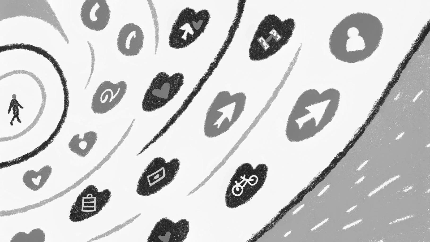
- Wayfinding Systems: In airports, pictograms like a suitcase for baggage claim or a plane for departures guide travelers seamlessly. These symbols are standardized globally (thanks to organizations like AIGA and ISO), ensuring consistency across cultures.
- Digital Interfaces: Smartphone apps rely heavily on icons. The magnifying glass for search or the three horizontal lines for a menu are so intuitive that they’ve become second nature. These icons save screen space and reduce the need for text, making apps accessible to non-native speakers.
- Emojis: Emojis are modern pictograms, blending emotion with communication. A heart emoji conveys love or appreciation universally, but its meaning can shift slightly depending on cultural context (e.g., a red heart vs. a green heart in some messaging apps).
Challenges and Opportunities
Designing icons isn’t without challenges. Cultural misunderstandings, overcomplication, or lack of testing can render an icon confusing. For instance, a “save” icon resembling a floppy disk might puzzle younger users unfamiliar with the outdated reference. This highlights the importance of user testing and staying attuned to cultural shifts.
On the flip side, the rise of digital platforms offers exciting opportunities. Animated icons, for example, add a layer of dynamism—think of a loading spinner that pulses to signal progress. As augmented reality (AR) and virtual reality (VR) grow, icons will evolve into 3D or interactive forms, further blurring the line between visual and verbal communication.
Why It Matters for Designers
As graphic designers, we’re storytellers, and icons are our shorthand. They allow us to communicate across borders, making our work inclusive and impactful. By mastering the principles of iconography and understanding their linguistic roots, we can create designs that don’t just look good—they speak to everyone.
Craft Your Visual Language
Love these design insights? Dive into my series on Jung archetypes like the Explorer and the Lover. Ready to make your brand unforgettable? Let’s connect at https://odavila.com/ for a quick discovery call.