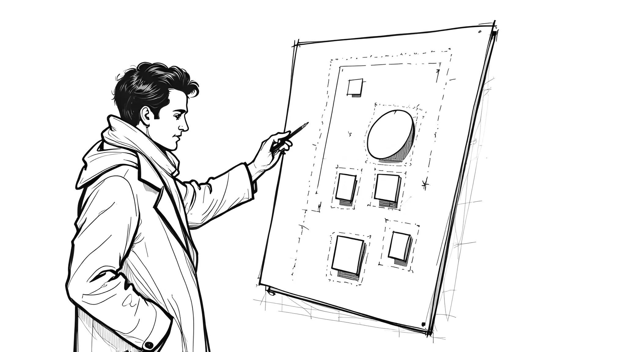
What makes a design instantly grab attention and guide the viewer’s eye effortlessly? It’s not just bold colors or striking imagery—it’s the subtle art of hierarchy. In graphic design, hierarchy is the backbone that organizes content, creates clarity, and delivers impact.
Why Hierarchy Matters
Imagine walking into a room where everyone is shouting at once. Chaotic, right? That’s what a design without hierarchy feels like. Hierarchy is the principle of arranging elements to show their order of importance, guiding the viewer’s eye through a deliberate path. It’s about making sure the most critical information stands out while the supporting details fall into place naturally. The goal? To create a seamless, intuitive experience that communicates your message effectively.
The Roots of Visual Hierarchy
Hierarchy isn’t a new concept—it’s rooted in how humans process information. Our brains naturally seek order, scanning for patterns and prioritizing what stands out. Think of a newspaper: the headline grabs you first, then the subheadings, and finally the body text. This isn’t accidental; it’s hierarchy at work. In graphic design, we use tools like scale, contrast, spacing, and alignment to mimic this natural process, ensuring the viewer knows where to look first, second, and third.
Breaking Down the Tools of Hierarchy
Let’s dive into the practical ways to create hierarchy in your designs:
1. Scale and Size
Bigger elements demand attention. A large headline or a bold logo naturally draws the eye before smaller text or icons. For example, on a website, the main call-to-action button is often larger than secondary links, signaling its importance. Use scale strategically to emphasize key elements without overwhelming the viewer.
2. Contrast and Color
Contrast is your secret weapon. Whether it’s a bold font against a light background or a vibrant color pop, contrast creates focal points. Think of a movie poster: the star’s name in bright white against a dark image grabs you instantly. Use color and contrast to highlight what matters most, but sparingly—too much can dilute the effect.
3. Spacing and White Space
White space isn’t just empty space; it’s a powerful tool to create breathing room and emphasize key elements. Tight spacing can make a design feel cluttered, while generous white space around a headline or image screams importance. Look at luxury brand ads—minimal text surrounded by vast white space feels elegant and intentional.
4. Alignment and Grids
Alignment creates order. A grid system ensures elements are placed deliberately, guiding the viewer’s eye in a predictable flow. For instance, a well-aligned website layout with consistent margins feels professional and easy to navigate. Misalignment, unless intentional for creative effect, can confuse and distract.
5. Typography
Fonts carry personality and weight. A bold sans-serif headline paired with a lighter serif body text creates a clear hierarchy. Vary font sizes, weights, and styles to differentiate headings, subheadings, and body text. For example, a blog post might use a 36pt bold heading, a 24pt medium subheading, and a 16pt regular body text to guide readers effortlessly.
Putting It Into Practice
Let’s say you’re designing a poster for a music festival. The headliner’s name should be the largest, boldest element—maybe in a vibrant color like red. The date and venue come next, in a smaller but still prominent font. Supporting acts and ticket details follow in smaller text, neatly aligned at the bottom. Add white space around the headliner’s name to make it pop, and use a subtle background texture to avoid clutter. The result? A poster that’s visually engaging and easy to understand at a glance.
This approach applies everywhere—web design, branding, social media graphics. Hierarchy ensures your audience gets the message without wading through visual noise. It’s not about shouting louder; it’s about speaking clearly.
Common Pitfalls to Avoid
Hierarchy sounds simple, but it’s easy to get wrong. Here are a few traps to watch for:
⚠️ Overloading with emphasis: If everything is bold or colorful, nothing stands out. Choose one or two focal points.
⚠️ Ignoring the user’s journey: Think about how your audience reads—left to right, top to bottom in Western cultures—and design accordingly.
⚠️ Neglecting mobile: Hierarchy must adapt to smaller screens. Test your designs to ensure they’re clear on all devices.
Ready to elevate your designs with the power of hierarchy? Start experimenting with scale, contrast, and spacing in your next project. Want more tips on mastering graphic design fundamentals? Check out my developing series on design principles at https://blog.odavila.com. Need help crafting visuals that captivate? Let’s connect at https://odavila.com/contact/ for a discovery call to bring your vision to life.
