
Have you ever looked at a design and felt instantly drawn to it, without knowing why? Chances are, the secret lies in its composition—the way elements are arranged to guide your eye and evoke emotion. Composition is the backbone of graphic design, turning chaos into clarity and ideas into impact.
In this article, I’ll break down the fundamentals of composition, sharing practical insights to help you create designs that captivate and communicate. Whether you’re a beginner or a seasoned designer, mastering composition is your key to unlocking visual harmony.
Why Composition Matters
Composition is more than just placing elements on a canvas; it’s about creating balance, guiding attention, and telling a story. A well-composed design feels intuitive, leading the viewer’s eye effortlessly from one element to the next. Poor composition, on the other hand, can leave viewers confused or disengaged.
Think of a poster for a music festival. If the band names, dates, and visuals are scattered randomly, the viewer struggles to know where to look. But with strong composition, you can highlight the headliner, emphasize the date, and make the vibe of the event pop—all at a glance.
The goal of composition is simple: make your design intentional. Every element should have a purpose, and together, they should create a cohesive whole.
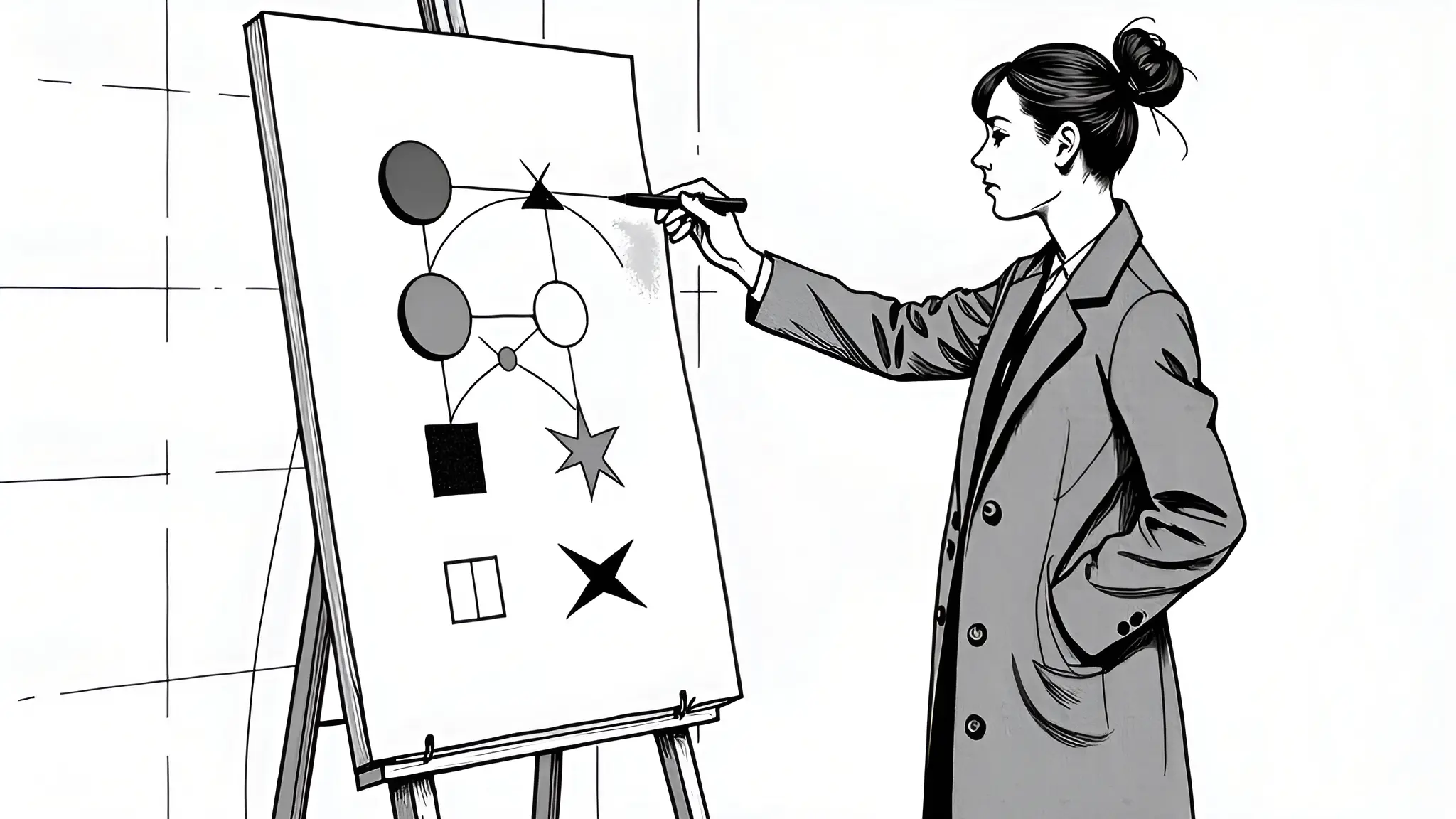
The Building Blocks of Composition
My approach to composition stems from years of experimenting with layouts, studying design principles, and learning from both successes and mistakes. Over time, I’ve distilled composition into a few core principles that form the foundation of any great design. Let’s dive into them.
1. Balance: The Foundation of Stability
Balance is about distributing visual weight across your design. Visual weight refers to how much attention an element draws, influenced by its size, color, or position. There are two main types of balance:
- Symmetrical Balance: Elements are evenly distributed around a central axis, creating a formal, stable feel. Think of a wedding invitation with centered text and mirrored flourishes.
- Asymmetrical Balance: Uneven elements create a dynamic, modern vibe. For example, a large image on one side might be balanced by smaller text on the other.
To achieve balance, imagine your design as a seesaw. If one side feels too heavy, adjust the size, color, or placement of elements to restore equilibrium.
2. Hierarchy: Guiding the Viewer’s Eye
Hierarchy organizes information to show what’s most important. It’s how you ensure the viewer sees the headline before the subtext or the call-to-action before the fine print.
You can establish hierarchy through:
- Size: Larger elements grab attention first. Make your key message the biggest thing on the page.
- Color: Bold or contrasting colors stand out. A bright button on a muted background screams “click me.”
- Position: Elements at the top or center are noticed first. Place critical info where eyes naturally land.
For example, in a website header, the brand logo might be largest, followed by a bold tagline, with smaller navigation links below. This guides users intuitively through the content.
3. Alignment: Creating Order
Alignment ensures elements line up in a way that feels cohesive. It’s like the invisible grid that keeps your design from looking sloppy. Common alignment types include:
- Left, Right, or Center: Text or images aligned to one side create a clean edge.
- Justified: Text spreads evenly across a column, common in books.
- Grid-Based: Elements snap to a grid for precision, like in a magazine layout.
A practical tip: use a grid system in tools like Adobe XD or Figma. Grids help you align elements consistently, saving time and ensuring polish.
4. Contrast: Making Elements Pop
Contrast creates visual interest by highlighting differences between elements. It’s what makes a design feel dynamic rather than flat. You can achieve contrast through:
- Color: Pair light text with a dark background or vice versa.
- Size: Place a tiny icon next to a bold headline.
- Shape: Mix sharp angles with soft curves.
For instance, a minimalist poster might use a stark black background with white typography for high contrast, ensuring the text is legible and striking.
5. White Space: The Power of Breathing Room
White space (or negative space) is the empty area between elements. It’s not wasted space—it’s a tool to reduce clutter, improve readability, and emphasize key elements. Too little white space makes a design feel cramped; too much can feel sparse.
Consider Apple’s branding: their ads often feature a single product against a vast white background. The white space draws your eye to the product, making it feel premium and focused.
6. Rhythm and Flow: Leading the Eye
Rhythm is how you guide the viewer’s eye through the design. It’s created by repeating or varying elements to establish a visual path. For example:
- Repetition: Repeating colors, shapes, or fonts creates unity. A website might use the same button style across pages.
- Pattern: Regular repetition, like a grid of images, feels structured.
- Flow: Curved lines or gradients can lead the eye smoothly from one element to another.
A well-designed infographic, for instance, uses rhythm to guide viewers from the title to data points to a final call-to-action, ensuring nothing is missed.
Putting It All Together
Now that we’ve covered the principles, how do you apply them? Start with a clear goal: what’s the purpose of your design, and who’s the audience? Then, sketch or wireframe your layout, keeping these principles in mind. Here’s a step-by-step approach:
- Define the Focal Point: Decide what the viewer should notice first (e.g., a headline or hero image).
- Establish Hierarchy: Arrange supporting elements to reinforce the focal point.
- Use a Grid: Align elements for a polished look.
- Balance the Layout: Distribute visual weight symmetrically or asymmetrically.
- Add Contrast: Ensure key elements stand out.
- Incorporate White Space: Give elements room to breathe.
- Test the Flow: Check if the eye moves naturally through the design.
For example, when designing a book cover, I might start with a bold title as the focal point, align the author’s name below, use contrasting colors for readability, and leave white space around the edges to frame the design. The result? A cover that’s both eye-catching and professional.
Common Pitfalls to Avoid
Even with these principles, composition can trip you up. Here are a few mistakes to watch for:
⚠️ Overcrowding: Too many elements can overwhelm. Prioritize what’s essential.
⚠️ Ignoring the Grid: Misaligned elements look amateurish. Always check your alignment.
⚠️ Weak Hierarchy: If everything screams for attention, nothing stands out. Be ruthless about what’s most important.
⚠️ Neglecting White Space: Don’t be afraid of empty space—it’s your friend.
The Emotional Impact of Composition
Composition isn’t just technical; it’s emotional. A balanced, harmonious design can evoke calm, while a dynamic, asymmetrical layout might spark excitement. As designers, we’re not just arranging elements—we’re shaping how people feel.
Take a charity campaign poster. A centered, symmetrical composition with soft colors and ample white space might convey hope and trust. An asymmetrical layout with bold contrasts could feel urgent, rallying viewers to act now.
By understanding your audience and the emotions you want to evoke, you can tailor your composition to amplify your message.
Ready to Elevate Your Designs?
Mastering composition takes practice, but it’s a skill that transforms good designs into great ones. Start small: pick one principle, like balance or white space, and experiment in your next project. Over time, these principles will become second nature, and your designs will shine with clarity and purpose.
Fascinated by the art of graphic design? Explore my full series on design fundamentals at https://blog.odavila.com. Want to create designs that resonate deeply? Let’s connect at https://odavila.com/contact/ for a discovery call to bring your vision to life.